Coronavirus Graph: Daily Confirmed Coronavirus Cases Per Million | Bar Chart Race [Updated 30 Jun]
Description
This coronavirus graph features the top 10 countries in the world by daily confirmed coronavirus cases per million inhabitants (7-day moving average) from 20 March 2020 to 30 June 2020. This serves as a timely follow-up video to the one on daily confirmed COVID-19 cases published at https://youtu.be/NwiCs4XVRdc.
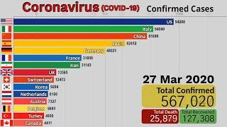
This highly infectious disease (COVID-19) was first reported in the Chinese city of Wuhan in Hubei province on 31 December 2019. Since then, it has spread to almost all countries around the world, triggering governmental intervention of varying degree in attempts to reduce and contain the spread of the coronavirus outbreak.
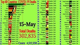
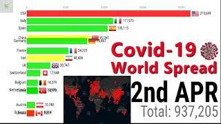
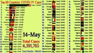
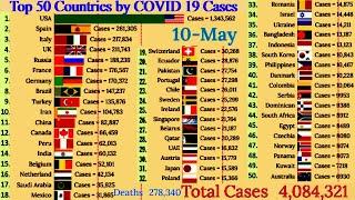
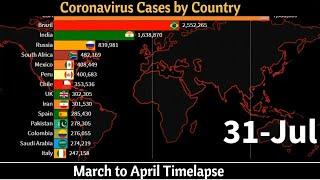
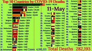
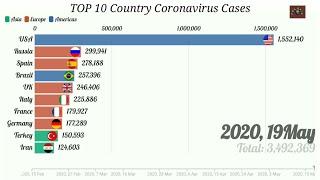
From this bar chart race, as of 30 Jun 2020, the COVID-19 has infected 10.273 million people worldwide and caused a death toll of more than 505 thousand people. In relation to the current data, the global case fatality rate (CFR) now sits at a staggering 4.92%.
Note that the United Nations geoscheme devised by United Nations Statistical Division (UNSD) is utilized to group countries/economies/territories according to their macro-geographical location for the purpose of statistical analysis. Therefore, the resulting classification by no means represents the political status or any other affiliation of the countries or entities in question.
Note: Countries with population size of 100,000 people or less are not included to ensure a more robust and accurate comparison between countries affected by the coronavirus in the world.
Objectives of This Video:
1) To find out the 10 hardest-hit countries by the COVID-19 in terms of daily confirmed coronavirus cases per million people from 20 March 2020 to 30 June 2020.
2) To visually inspect the spread of the COVID-19 outbreak across the globe from the perspective of daily confirmed coronavirus cases per million over time with the help of the coronavirus graph.
Some of the countries with the highest number of daily confirmed COVID-19 cases per million as depicted in the coronavirus graph are Qatar, Bahrain, Oman, Armenia, Chile, Panama, Brazil, Kuwait, Sweden and United States.
------
This video is part of the video series called “COVID-19: Vital Coronavirus Statistics Coverage” created to observe, among other things, the latest update and development of the coronavirus pandemic using coronavirus graph. For instance, the prevalence and mortality rate of the coronavirus in countries all around the world over time are inspected extensively on this playlist.
Link to the video playlist: https://www.youtube.com/playlist?list=PLRA_U4Pw2yqkluESn3JxpA710y_HEb_dv
------
Questions Worth Asking:
1) Why do you think these countries are being featured in this coronavirus graph as the top 10 countries in the world that are most severely affected by the #COVID-19 pandemic?
2) Could the countries’ policy response to the virus outbreak be solely judged by the daily number of confirmed coronavirus cases per million reported? If not, what other factors need to be taken into account when it comes to evaluating governmental response to the #coronavirus outbreak?
3) What should policymakers do to ensure sustainable development in both the economy and the environment while maintaining public health and safety?
Let me know what your thoughts are for each of the questions mentioned above.
-----
We have created the following playlists to organize our videos by theme:
Greatest Battle of the 21st Century https://bit.ly/2Rzd93P
GDP: Economic Performance Rankings https://bit.ly/37dfmZf
GDP Per Capita: Economic Performance Rankings https://bit.ly/325PXz4
Social Media Rankings https://bit.ly/38r3nYp
Demographic and Social Statistics: Population https://bit.ly/2uhALSM
COVID-19: Vital Coronavirus Statistics Coverage https://bit.ly/35cRS6G
Do check out similar videos on the COVID-19 pandemic:
Coronavirus Graph: Daily Confirmed Coronavirus Cases By Country | Bar Chart Race [Updated 28 Jun] https://youtu.be/NwiCs4XVRdc
Coronavirus Graph: Daily Confirmed Coronavirus Deaths | Top 10 | Bar Chart Race [Updated 29 Jun] https://youtu.be/wsFix4ByFlc
Coronavirus Graph: Total Confirmed Coronavirus Cases Per Million | Bar Chart Race [Updated 26 Jun] https://youtu.be/P7zvIpsGNUs
-----
Also, we invite you to subscribe to StatStorm so you can stay informed of the moment a new video is released.
https://www.youtube.com/channel/UCSkR1lcAF8nCJM6ca_OQ_Ng?sub_confirmation=1
Facebook page: https://www.facebook.com/StatStormOfficial
Twitter: https://twitter.com/StatStorm
Pinterest: https://www.pinterest.com/StatStorm/
Keep in touch and have a nice day!
-----
Data Sources:
Our World in Data https://ourworldindata.org/
European Centre for Disease Prevention and Control (ECDC) https://www.ecdc.europa.eu/en
Music Source: YouTube Audio Library
Music Titles: Extinction Level Event (Sting) & Demise & Wiser
https://www.youtube.com/audiolibrary/music?nv=1
https://youtu.be/kEtMA5MQVjA
https://youtu.be/kEtMA5MQVjA
![Coronavirus Graph: Total Confirmed Coronavirus Cases By Country | Bar Chart Race [Updated 31 May]](https://no-mar.com/uploads/thumbs/a46ab5022-1.jpg)


![Coronavirus : Top 10 COVID-19 Active Cases and Recoveries with Map + Line Graph [Updated 2020-04-12]](https://no-mar.com/uploads/thumbs/affcdd905-1.jpg)


Comments